I really don’t like the design of the progress pride flag, and I couldn’t really put my finger on it until I saw this: https://nava.org/good-flag-bad-flag
For reference, here is the flag I’m referencing as “bad flag”:

And here is the original:

So, the original has too many colors, but it’s the colors of the rainbow. In order. It’s recognizable from really far away, and it’s dead simple to draw.
With the Intersex flag, that’s 14 colors. There are three shades of “purple”. The circle won’t be visible from far away. The chevrons are too thin to be very recognizable from far away.
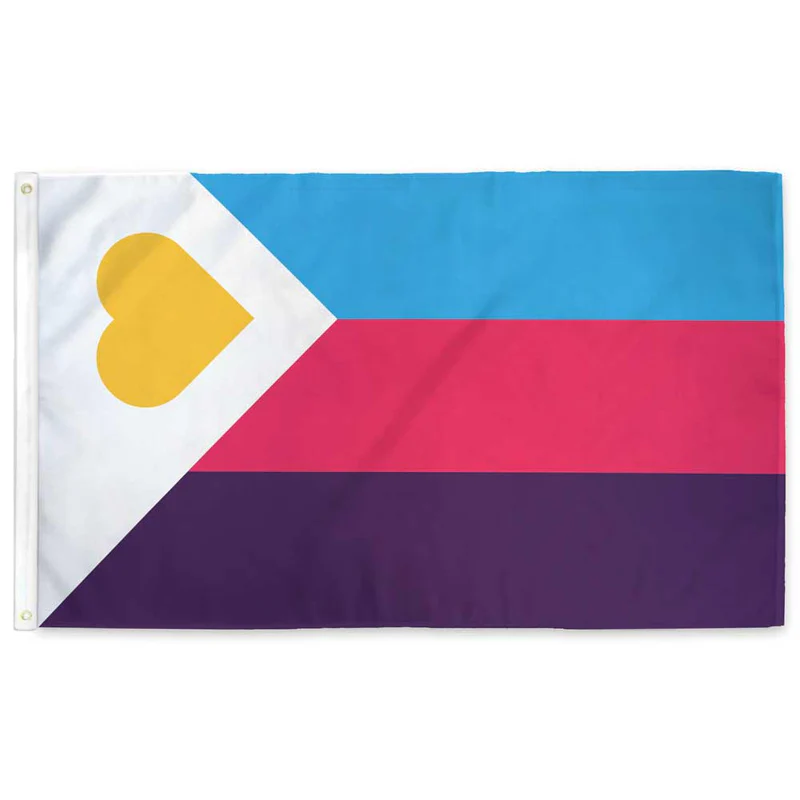
It’s not like there aren’t good pride flags. Like there are AMAZING ones:


Edit:
In case you don’t know what these are: https://flagsforgood.com/collections/pride-flags


I think it’s basically just “feature creep.” Too many ideas trying to be crammed into one symbol. And what’s annoying, to me, is that the rainbow by itself was already supposed to represent everyone. That’s why it is a rainbow.
It’s the same phenomenon as “LGBTQI+”
It was literally LGB at one point. I understand the concept of inclusion but I think pursuing it by appending and appending and appending is a lousy way to go. I believe the “Q” was finally added in part because it was hoped to be some kind of catch-all, but that didn’t work.
I propose reducing it down to QT
You have reached enlightenment. The universe has no more secrets to you, young one.
You know too much.
CATCH THEM, BOYS !
We could always use the GRSM acronym (Gender, Romantic, and Sexual Minorities)
I just learned about GSM two days ago here on Lemmy. Now I am learning about GRSM, and while I like both, learning that there is now an additional letter leads me to believe it may go down the same rabbit hole.
Really? I’ve never heard just GSM.
I’ve gone down the rabbit hole and gsm is apparently a common incorrect way to say it. Also a lot of LGBTQ people dislike the term.
Really? Why?
I’m just hearing it for the first time in this thread but my first impression isn’t great. Do you really want a label that brands you as a “minority?” That doesn’t seem like a great first step toward equality.
That was the general consensus from what I read about using the term “minority”. As someone who has been labeled a minority their entire life, the term didn’t strike me as odd from a technical standpoint point, but I can see where it would not sit well for many people.
Oh shit I unironically like this.
I’m a fan of it but it doesn’t seem widely known. Maybe we should spread the word.
Maybe we should shorten it to Q++ 😅 (j/k)
I guess I would like to schedule a meting with the project manager and/or customer to discuss the flag specification…
Make sure someone takes minutes so we can maximize our synergies and deliverables.
Why is this upvoted so much? Do you know anything about the Pride flag? Each color represented a particular concept (e.g., sex, sunlight, nature). The colors mean something and weren’t just a catch-all concept to “represent everyone.” Like you’re just saying shit lol. The fact that I see this dumbass discourse EVERY YEAR tells me that maybe it’s not just aesthetics that folks are complaining about, I think some people are bitches and don’t wanna make room. The Progress Pride flag is great and makes clear that it really is for everyone, not just gay men. Get over yourself fr.
The original Pride flag was designed with eight colours, but quickly moved to six and seven stripes because of issues with sourcing dyes and mass production. As others have said, each colour did have a specific meaning like Sex, Life, Harmony, Art, Sunlight. These were aspects of the queer community, but they did not mean specific or narrow identities, and did not only describe ‘gay’ or ‘lesbian’ people.
In the words of Gilbert Baker (who designed the initial flag) “We needed something beautiful – something from us, and the rainbow is so perfect because it really fits our diversity in the sense of our race, our gender, all of those things.” Since then people have added specific colours and extra features to draw attention to identities that they felt were undervalued or overlooked, which is laudable goal, but not because the original did not include everyone.
You’re throwing around a lot of strong negative claims about the discussion here, if you really want to make a case that the meaning of original flag did not include queer people who were black or whatever, please bring some sources. And just to note, personally I actually like the chevrons of the Progress flag, but that doesn’t invalidate people claiming that the original flag included everyone.
Hot pink - Sex
Red - Life
Orange - Healing
Yellow - Sunlight
Green - Nature
Turquoise - Magic/Art
Indigo - Serenity
Violet - Spirit
I’m seeing on Wikipedia that the original colors represented stuff like sunlight and life. Who was excluded by these categories?
Nobody. But apparently that means you’re a “dumbass”.
People of color, trans and intersex people, and people who died in the AIDS crisis.
Why do you think they are excluded? Do those concepts not apply to them equally as much as they do to anyone else?
People of color, trans and intersex people, and people who died in the AIDS crisis.
“the Philadelphia Pride flag added black and brown stripes to represent people of color. The Progress Pride flag further incorporated a chevron with black, brown, light blue, pink, and white stripes to represent transgender people and those lost to AIDS. The Intersex-Inclusive Progress Pride flag, designed by Valentino Vecchietti in 2021, added a yellow triangle and purple circle to represent intersex inclusion”
Also, people who like the color “Medium Aquamarine” are not represented either
Truly outrageous that we won’t (obviously out of pure hatred) represent everybody with a different color/symbol. After all we’re only ~8 billion people on planet Earth.
A flag with ~8 billion individual lines, all of a unique color.
Might be hard to render on a computer. Most displays can only display around 16 million colors. 😔
KOLANAKI