
Credit: Mr. Lovenstein :: Over the Line | Tapas Comics
RSS Feed: https://tapas.io/rss/series/3346
Bonus panel (animated gif, wait for it)
The second one actually does read easier, and that’s because with characters it’s the thought that counts
This extends to every day life… minor mishap? Nah fam… let’s introduce life ruining quest paths… what the F is wrong with me?
Me: “I’m lonely. I’ma find a gf or bf.”
One terrible marriage + divorce later
Me: “I’m lonely. But I’m too scared to find a gf or bf. What if it turns out like last time?”
Who writes TODAY in All capitals on paper?
What happens more often is my sloppy 6 and 0 look too similar.
I’ve picked up a habit to (sometimes) write in all caps. On the flipside, I’ve picked up some strategies to differentiate letters and numbers from each other:
- 1 would have the top serif if it needs to be differentiated from lowercase
l. - 2 would start like a question mark, and then continuing on with a horizontal line, something like: ʔ︭
- 5 would be written in two separate strokes, the top one from left to right, and the second from top-left straight down, then a semi-circle going clockwise
- 6 would be written in one smooth stroke from top-right going counter-clockwise down, then up halfway, then intersecting itself at the bottom rather than bottom-left. (Kinda like φ)
- 7 would have the middle bar (differentiating it from a 1)
- 9 would have two strokes, first is a loop starting from top-right counter-clockwise almost meeting itself; second stroke goes from where the first one ends straight down-left-ish
- 0 would have a light stroke going from top-right to bottom-left
- D would be two strokes, kinda like this:
|> - I would have the top and bottom serifs
- J would have its top serif and its tail emphasized and angular, kinda like this: ˧˩̅ (I really hope the unicode characters show up properly)
- S would have its upper part smaller, and its lower part larger and more emphasized, so that it’d look more like a coiled snake.
- U would look like my lowercase u (with the right vertical downward stroke).
- V would be written in two strokes: top-left to bottom, and top-right to bottom.
- X is also written in two strokes: top-left to bottom-right, and top-right to bottom-left
- Z would optionally have the middle bar (
Ƶ), but it usually doesn’t need it to differentiate from2
I do the bars for 7, Z and the Ø for 0 when I’m worried about confusion. D I make sure the bar is straight or concave, in two strokes.
Also my 1s and lowercase Ls are both single stroke so to differentiate I make it look more like a mirrored J.
- 1 would have the top serif if it needs to be differentiated from lowercase
My 5 and S look the same
Missed opportunity for “5ame”
Same, I can’t write a 5 in one smooth motion, when I try to it ends up looking like an S.
My 5s are apparently unreadable for most people. Whenever someone asks me what that sign or letter is on anything I wrote I will say it’s a 5 without looking. They’ll say how I didn’t even look. But it’s always correct.
Your 5 is just a fucked up b, right?
No, it’s a 5. Idk why people don’t see it.
attach pic of your 5 and let lemmy judge
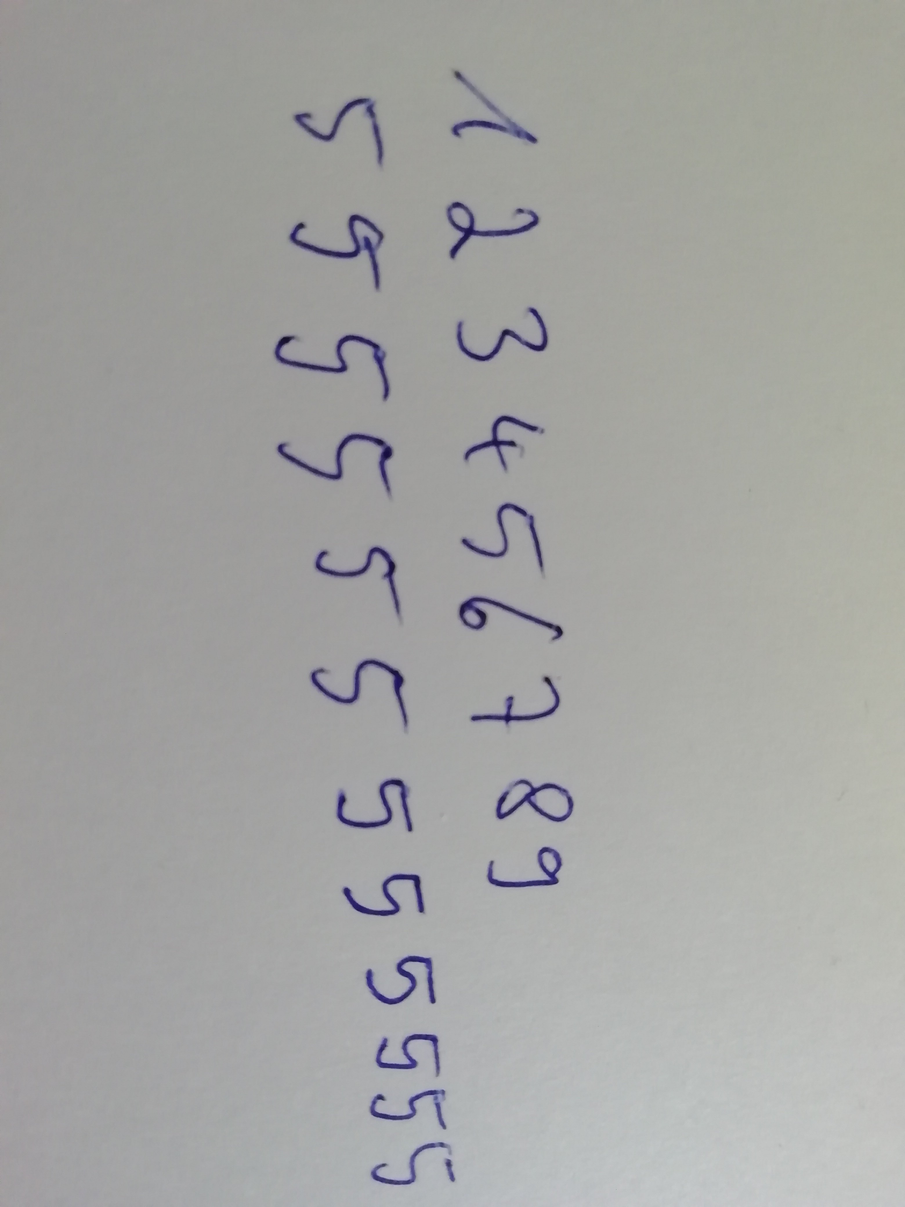
yeah kinda messy I rate 5/10
here’s my suggestion for making it less ambiguous
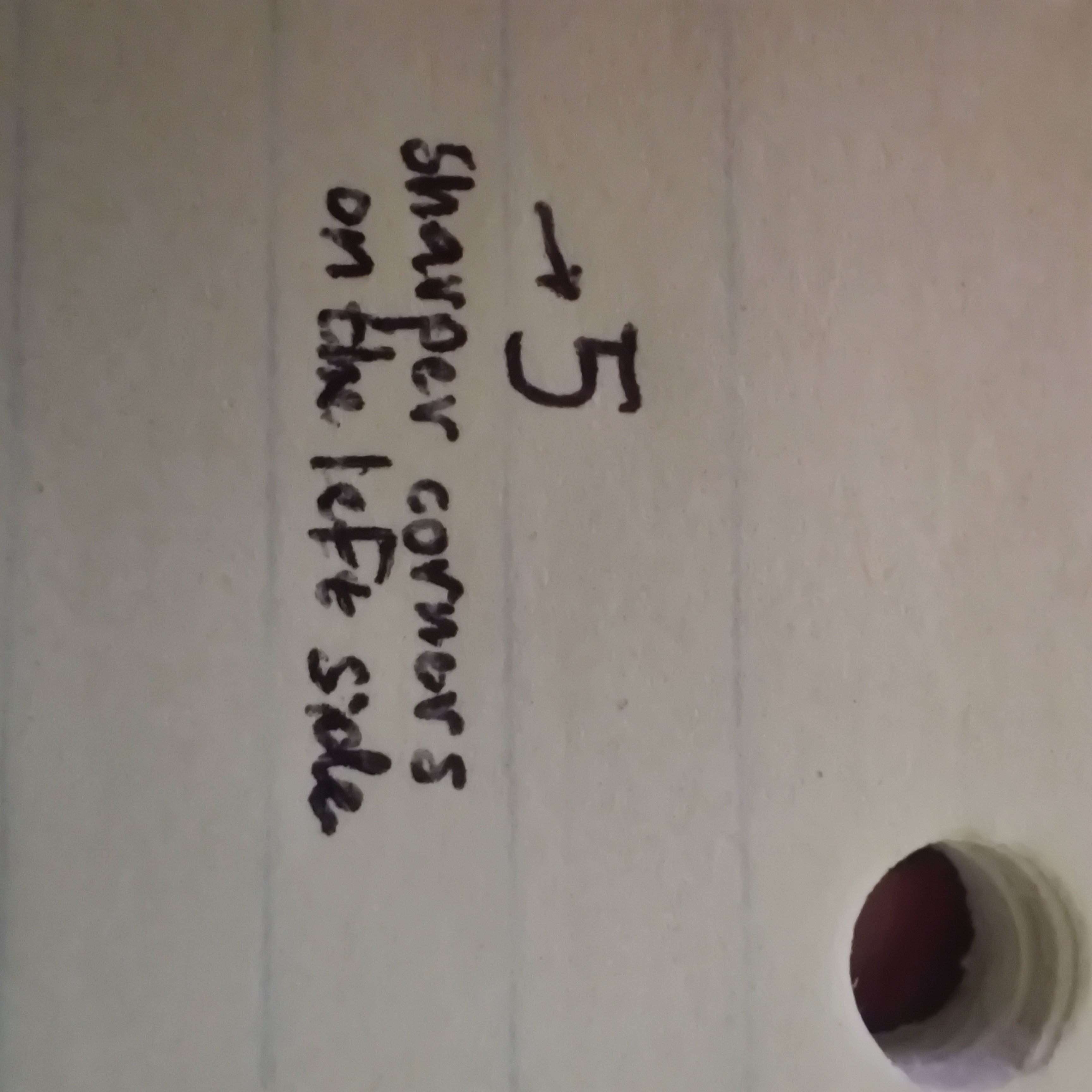
That’s still a 5 out of 10 though.

